
Wayfinding & Signage 101

What is wayfinding and how does it help in spatial branding?
Wayfinding isn’t just about navigation—it’s an opportunity to enhance brand storytelling and ambience through visuals. Here’s how:
- Brand Voice & Messaging – 3D text, quotes, and supergraphics that invite users into the brand’s purpose and values.
- Thematic Concepts – Wall murals, installations, and exhibits that reflect the brand’s beliefs, people, and context.
- Legacy & Engagement Walls – Timelines, photo walls, and interactive displays that showcase the brand’s journey and impact.
When done right, wayfinding becomes more than just signs—it becomes an experience. Signage is one part of wayfinding that guides people to experience the space efficiently.
Types of Signage that support easy exploration

Here’s a breakdown of the key signage types required for effective wayfinding:
- Floor Directory
Provides an overview of the space, listing key functions and areas on each floor. Typically found near stairways, lobbies, and entrances for easy access.
- Directional Signage
Guides users from Point A to Point B (and beyond) within a space.
Placed at junctions, intersections, and critical pathways to ensure smooth navigation.
- Room & Zone Signage
Identifies specific rooms or zones, indicating their purpose.
Found on closed rooms or dedicated areas like meeting rooms, lounges, or themed spaces.
- Utility Signage
Marks special service areas such as restrooms, janitor rooms, and maintenance zones.
Helps in locating service-oriented spaces efficiently.
- Safety Signage
Displays instructions and compliance guidelines for emergency exits, fire safety, or restricted areas.
Essential for ensuring user safety and regulatory adherence.
- Numeric & Allotment Signage
Used for numbering repetitive elements like lockers, parking slots, or seating arrangements.
Helps in organized allocation and easy identification.
Effective signage enhances user experience, ensuring clarity, efficiency, and brand consistency in a space. Stay tuned for more insights on spatial branding!
Universal Design Principles in Signage Design
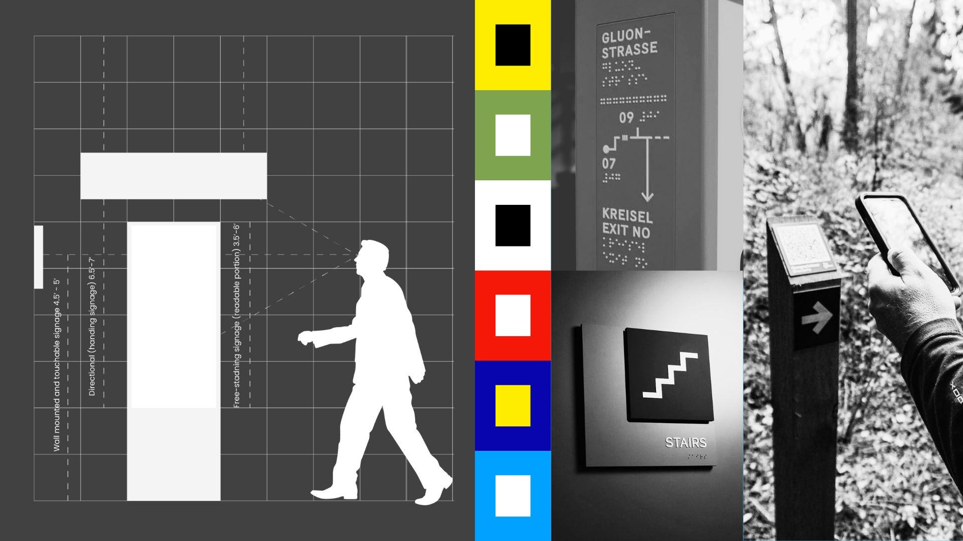
It is more than just signs—it's about clarity, inclusivity, and accessibility. The goal is to create a single solution that can be adapted for all — blending icons, language, materiality, and tech seamlessly.
Key design principles include:
- Clear visual hierarchy, clear fonts and optimal positioning. Its vital to ensure all signages are placed in the line of sight. The use of san-serif fonts like: Helvetica, Arial, Futura, Frutiger, Univers etc. enhance readability comfort and clarity.
- High-contrast color ratios matching global accessibility standards caters to all kinds of viewers to quickly read and comprehend signage and directions.
- Tactile design, including raised elements, textures and Braille fonts allows people with visual impairment to access and use a space comfortably.
- Tech-integrated signage with audio and translations for linguistic flexibility, personalized guidelines provides a user friendly experience.
Always remember to adapt these principles to match your brand’s visual language.